Since it's the holiday season and everyone is trying to sell stuff I made a revision to the ARTandWATER main page that includes a bunch of thumbnails of several tshirt designs. There are links from there that go to the main tshirt site but it's cool to see them all laid out together for some easy comparison and enjoyment.
A note: no need to buy anything right away unless you find yourself inspired to do so. I am just putting these up for your enjoyment and some possible feedback. The decision to get a tshirt is completely up to you only if you really want one.
It is a running record of the creative process. (Images are purposely degraded then compressed to help protect intellectual property.)
Thursday, November 29, 2007
Wednesday, November 28, 2007
psychic tension
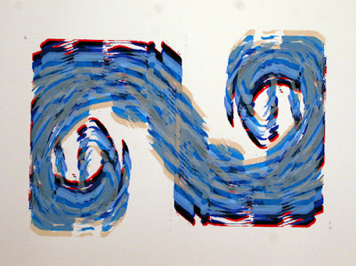
What started out as an exersize with equiluminant colors, to discuss vibration, movement, and the diffuculty of seeing, quickly turned into a revelation about the psychic tension of living in an increasingly crowded and complicated world.
Post-modern theory has taught us that “grand narratives”, as a way to organize everything with one giant meta-structure, keep failing and that more organic growth and organization seem to progress at initially disorganized rates. The disorganiztion, the chaos, have patterns (sometimes vague, sometimes strong) that trick us into thinking that we can find an overall pattern and see the organiztion of everything.
Using Jackson Pollacks more (in)famous works of large abstract expressionist paintings as an example, we see that the structure is scattered and seemingly random. But, paint marks are thrown with similar motions as the artist worked around the canvas repeating the action of painting. There is an order within the disorder, but one that cannot be easily explained without the formulas of fractal geometry. I use the familiar splash mark as a sign of this chaotic painting technique and choose to repeat it with the screen instead of my hand. Each repetition is nearly identical to the last so I am free to move the mark in a less ordered fashion.
This freedom allows me to imagine more possibilities. Unfortunately, more possibilities only leads to even more possibilities. This is indictitive of the psychic tension created by all of the luxuries and freedoms that we have in this modern (or “post-modern”?) era. As the western world has moved through a multitude of government organiztions towards finding a perfect solution (“the answer”) we have discovered that one solution might not be the best, and certainly is not the only solution. In deconstruction the reasons why perfetion evades us many people give up and either go to the disco or go shopping.
But, the need to have something still exists. We can only drop out for so long before wanting to fill the void. Today (un)fortunately we have more colors, models, choices as consumers of physical products as well as information so the quest for any kind of truth (or possibilities of truth) is easily distracted by another consumer product.
Many of possibilities exist. Millions of consumer products. Many of ways to spend free time. Many ways to think about what to do next. Many ways to surf the same wave. Many ways to paint the same painting or make the same print. Many colors from which to choose. How do we know what to choose?
I chose through both favoritism, accident, and some color associations with movement and water. I stopped because I ran out of paper.
Tuesday, November 27, 2007
water drops and lava photograpy
water
http://www.darkroastedblend.com/2007/11/liquid-art-droplet-photography.html
lava
http://www.darkroastedblend.com/2007/11/hawaiian-volcanoes-beauty-terror.html
I think the water looks like glass or ice; some solid form when it's not moving, but you still see the motion in a still frame. Same for the lava flows once they stop moving.
Monday, November 26, 2007
John Anderson
John and I were classmates at American University. Take a look at the website he is working on and enjoy the art that he makes.
http://www.johnjamesanderson.com
http://www.johnjamesanderson.com
Friday, November 23, 2007
professor Marie Roberts
I graduated from Fairleigh Dickinson in 1995. While I did not meet Professor Roberts until half way through my undergrad program she had tremendous influence on me as a painter. During the year after my graduation I was allowed to keep studio space on campus (because nobody else wanted to use that leaky, pigeon infested space) and Professor Roberts was happy to provide feedback and criticism when I needed it.
In 1996 she demonstrated excitement about the "return" of the sideshows to Coney Island where her family had lived and worked. The videos (below) tell her story of rediscovery as well as provide a brief history of the Coney Island side shows.
http://www.youtube.com/watch?v=dXazC3yCIl0
click on the links and you can watch
http://www.youtube.com/watch?v=IwKip43Nke8
Monday, November 19, 2007
revision
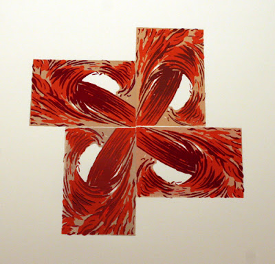
I did as I said in the last post, and printed over three of the six copies to replace teh blue with red. With only one layer of red over the blue, the result is very brown. I left some of those but made a second pull on others to bring more of the red out. Now the colors are more realated and I think the underlying structure comes forward a bit better.
Sunday, November 18, 2007
color decisions (making a print)
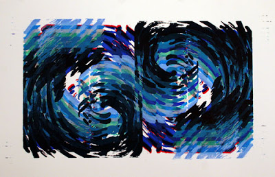
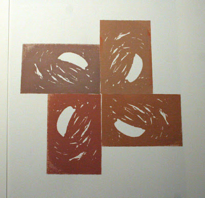
I wanted the base color for this cycle to be a little bit different in each wave, then have the other two colors be the same and see what the relative colors were for each image as they formed the cycle
here is the first pass, frist screen, first colors
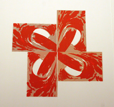
and the next screen added some shape to the image as well as the spinning, cyclical motion
the last screen makes the wave image more obvious but brings about some interesting connections between each of the four blocks
I'm not sure if the blue is too much contrast, or makes the shape too linear. there are six of these and I think that I'll go over a couple of them with the screen again and lay some red over the blue to bring some more color harmony into the picture. Comparing the two versions will be fun.
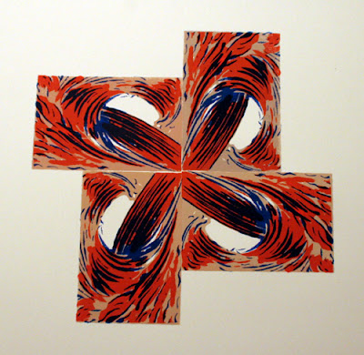
one note about the small spaces between the blocks: the misregistration is on purpose, sorta Part of the intent in my process is to expose the hand-made look and feel to the images. I registered this print with lines drawn on the table, which no matter how accurate I am, the process is imperfect. Gaps and overlaps also add an unstable feeling to a very contrived image. The four blocks feel like they might either be flying apart or colliding.
here is the first pass, frist screen, first colors
and the next screen added some shape to the image as well as the spinning, cyclical motion
the last screen makes the wave image more obvious but brings about some interesting connections between each of the four blocks
I'm not sure if the blue is too much contrast, or makes the shape too linear. there are six of these and I think that I'll go over a couple of them with the screen again and lay some red over the blue to bring some more color harmony into the picture. Comparing the two versions will be fun.
one note about the small spaces between the blocks: the misregistration is on purpose, sorta Part of the intent in my process is to expose the hand-made look and feel to the images. I registered this print with lines drawn on the table, which no matter how accurate I am, the process is imperfect. Gaps and overlaps also add an unstable feeling to a very contrived image. The four blocks feel like they might either be flying apart or colliding.
Friday, November 16, 2007
silkscreen decisions
I knew that I wanted to repeat the image at least three times. It made sense to also make an upside down row to complete a cycle. The image below is the first step. This entire process uses two screens.

Interesting, but there needed to be more. I turned away from the fleshy colors and back to water-associated colors for the next layer.
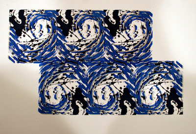
at this point I already was liking the image and wondered if I should stop. Since I really wanted to see what could happne if I kept layering, I saved one copy of this version and continued layering on top of the others.
I also took out two additional pieces of paper to experiment with some other combinations as the process continued.
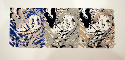
Below you will see the final version. I stopped counting the layers after the fifth one. There are at least six layers of the main screen and three of the other screen.


Interesting, but there needed to be more. I turned away from the fleshy colors and back to water-associated colors for the next layer.
at this point I already was liking the image and wondered if I should stop. Since I really wanted to see what could happne if I kept layering, I saved one copy of this version and continued layering on top of the others.
I also took out two additional pieces of paper to experiment with some other combinations as the process continued.
Below you will see the final version. I stopped counting the layers after the fifth one. There are at least six layers of the main screen and three of the other screen.

Wednesday, November 14, 2007
random tension and chaos
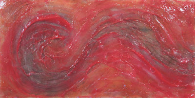
Chaos and Symetry in nature.
Chaos defined as non periodic order
Symetry defined as a reiteration; either similar or purposely opposed
Tension, Friction, Viscosity
forces moving in opposition
do they slip by each other with minimal effort?
or do they collide, break apart, merge?
I suppose that the answer is differenct depending on the scale of obeservation; whether I am looking at the larger picture or closely examining a boundary layer between the opposing forces.
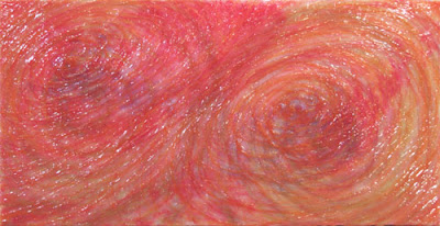
Silkscreen fun
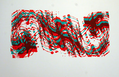
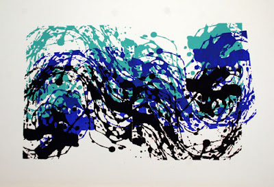
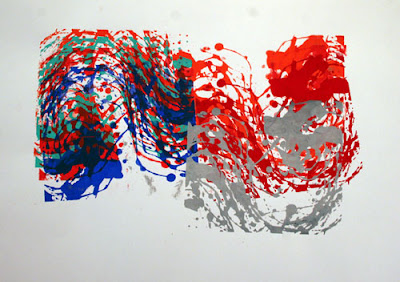
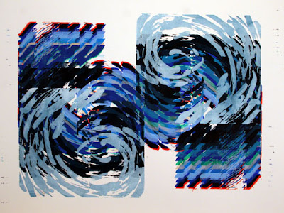
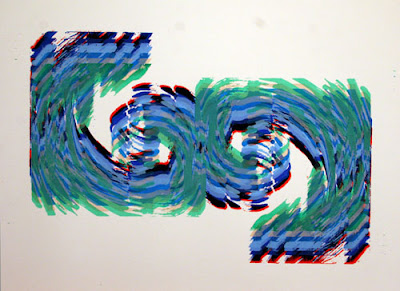
working on some prints for the Wave Cycle show in January. These are the first couple of screens I made based on the thick acrylic paintings I've been making. The idea is to continue working with motion and layering in another medium. Working with printmaking techniques also allows me to address varying differences in repetition like I wrote about here before I tackle the issue in thicker paint.
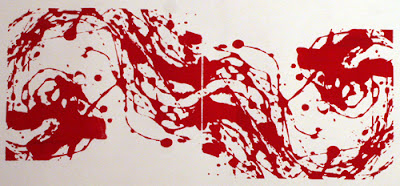
This is the first image, printed twice here to show the repeated shapes and motion within each image and how they can be linked together to start larger patterns.
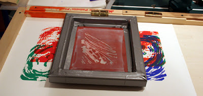
I got a little carried away tonight, having fun making a series of 6 prints, moving the registration marks to make the layers obvious and the over all image vibrant and confusing. The photo is not the best, but if you look cloesly you'll see three different reds. I like the underlying green and blue in this one, but I think the next work will involved related local colors in multiple layers.

some influences......
Pollack
Rauchenberg
Ryan McGinness
This is the first image, printed twice here to show the repeated shapes and motion within each image and how they can be linked together to start larger patterns.
I got a little carried away tonight, having fun making a series of 6 prints, moving the registration marks to make the layers obvious and the over all image vibrant and confusing. The photo is not the best, but if you look cloesly you'll see three different reds. I like the underlying green and blue in this one, but I think the next work will involved related local colors in multiple layers.
some influences......
Pollack
Rauchenberg
Ryan McGinness
Monday, November 12, 2007
Bravo!!!
don't agree with everything, but most of it. It's an important artistic arguement, and one that exposes the ever-present "generation gap" that was coined by boomers when they were kids and now rarely recognized that they are the dominant generation.
(the embed is not working so click on the link below to see watch what I am talking about)
http://www.ted.com/talks/view/id/187
(the embed is not working so click on the link below to see watch what I am talking about)
http://www.ted.com/talks/view/id/187
Thursday, November 08, 2007
Modernist childhood puzzles
with a new grand daughter and a local friend's little girl around my parents they have broken out all the old toys that my brothers and I grew up with. These were three of my favorite puzzles, long after I was "too old" for them.
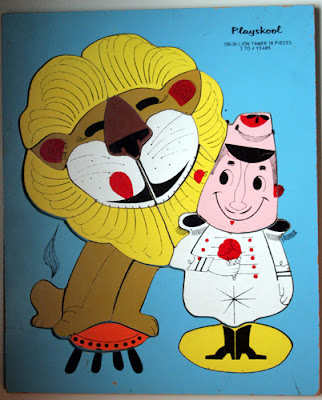
Perhaps these were a big influence on me and how much of a modernist perspective I have. I remember thinking that the shapes of the puzzle don't really make sense. Some of the decisions about where to make the cuts (to make the pieces) were pretty random,but less random than a jigsaw puzzle. Each piece divides space in a non logical but still sensible manner.
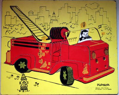
These were very helpful when I was learning how to draw from observation. The transition from drawing objects like a small child (for example: drawing a circle as a circle instead of in perspective) to representing observed space is difficult. The curious shapes of these puzzles taught me that the observed world, as seen through our eyes in perspective from our point of view, did not perfectly reflect a mechanical, rigid definition of how something is constructed.
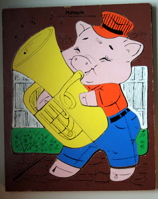
This makes me realize that I am still struggling for a balance between copying what my eyes see and redefining (sometimes didactically) the nature of my subject; how they are constructed and how they move. And it can be traced back to childhood.
Perhaps these were a big influence on me and how much of a modernist perspective I have. I remember thinking that the shapes of the puzzle don't really make sense. Some of the decisions about where to make the cuts (to make the pieces) were pretty random,but less random than a jigsaw puzzle. Each piece divides space in a non logical but still sensible manner.
These were very helpful when I was learning how to draw from observation. The transition from drawing objects like a small child (for example: drawing a circle as a circle instead of in perspective) to representing observed space is difficult. The curious shapes of these puzzles taught me that the observed world, as seen through our eyes in perspective from our point of view, did not perfectly reflect a mechanical, rigid definition of how something is constructed.
This makes me realize that I am still struggling for a balance between copying what my eyes see and redefining (sometimes didactically) the nature of my subject; how they are constructed and how they move. And it can be traced back to childhood.
High School graphics class
Mom was cleaning up the basement and found an old screen that my brother made in high school, so I decided to see if it would still work. This is the result.
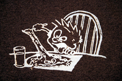
My brother and I were in the same class. He was a freshman and I was a senior. When the class got to screen printing, we both decided to copy images from our favorite comic strip artist.
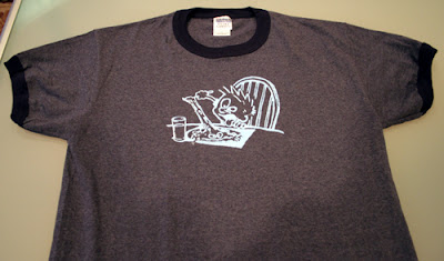
Here is the only remaining copy of the one I made. The screen is long gone and the shirt I made was stolen the day before school started at University of Southern Maine.
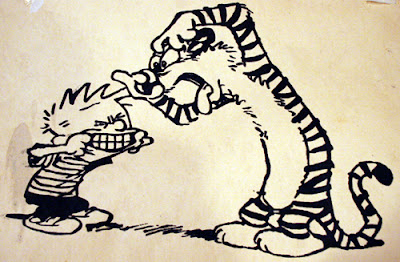
My brother and I were in the same class. He was a freshman and I was a senior. When the class got to screen printing, we both decided to copy images from our favorite comic strip artist.
Here is the only remaining copy of the one I made. The screen is long gone and the shirt I made was stolen the day before school started at University of Southern Maine.
Tuesday, November 06, 2007
repetition edition
I keep coming back to this desire for repetition. It's a need to explore many possibilities within the same structure. This is something that first revealed itself to me in 2002 when I started working with prints again. I made similarly themed monotypes. Then, I made blockprints that revealed the process of making the block. For the past two years I've focused, and concentrated on waves and water.
Now, I'd like to be more methodical with the thick acrylic transparent paintings, as a way to create a more interesting dialogue about repetion and change. The question I have, for myself, is how strict I will be about the process, versus how much I will allow small whims and desires to effect each decision throughout the process.
Now, I'd like to be more methodical with the thick acrylic transparent paintings, as a way to create a more interesting dialogue about repetion and change. The question I have, for myself, is how strict I will be about the process, versus how much I will allow small whims and desires to effect each decision throughout the process.
Thursday, November 01, 2007
the art world needs a thesaurus
sometimes to inject a bit of variety in the typical statements, because there seems to be a collection of key words not commonly used by average people that are actually very average themselves. For example, it seems like every third statement or review uses some form of the word "imbue"
a quick glance over here
http://thesaurus.reference.com/browse/imbue
would suggest much more accurate and often reader-friendly words such as
bathe, diffuse, impregnate, inculcate, infuse, ingrain, instill (oh that's a good one), permeate, etc.....
In grad school, someone had a running list (from crits) of words that were used/abused/over-used, often for the sake of sounding "arty". Too bad I"m such a poor record keeper. Finding that list would be fun.
Subscribe to:
Posts (Atom)
